OST Statistics – Accent Graph
The OST Statistics – Accent graph displays the bandwidth savings and performance benefits you are achieving with
Review the following variables on the OST Statistics – Accent graph.
Note: This graph only shows data when Accent is enabled.
Figure 1: OST Statistics – Accent Graph
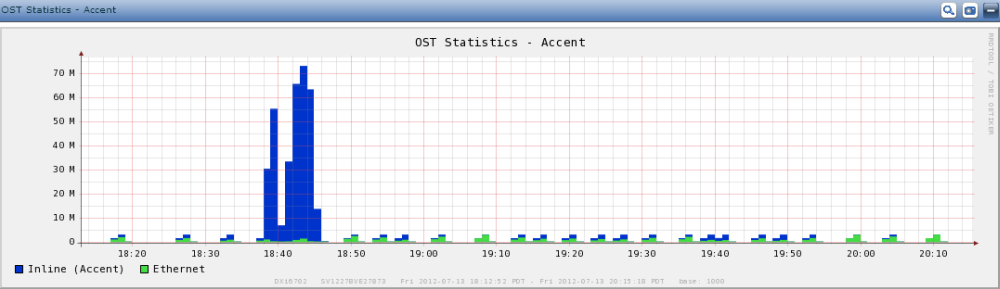
Displays data arriving at the appliance from an Accent-enabled OST server.
Compare the Inline (Accent) variable to the Ethernet variable to see the amount of network bandwidth savings that Accent is achieving. In addition, you can compare the rate shown by the Inline (Accent) variable to the overall performance of the appliance in the Data Volume Overview Graph.
Displays the data arriving at the appliance via Ethernet.
Tick marks at the top of the graph indicate whether Accent is enabled:
- Blue – Accent is enabled for the appliance.
- Green – Accent is not enabled for the appliance.