WebGUI
The WebGUI is a web-based graphical user interface. The WebGUI is the primary way you will interact with the library. All library operations can be performed through the WebGUI. You access the WebGUI by typing the library IP address into a web browser.
When using the WebGUI, do not use the browser refresh button. It will end your session and require you to log in again.
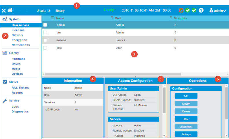
| Item | Name | Description |
|---|---|---|
|
1 |
Header | Provides visual indications of library status and quick access to frequently used functions. |
| 2 | Menu | Allows you to select the main functional areas within the library. The menu is in the order you would use to configure your library the first time. |
| 3 | North Panel | Displays the choices available for each menu selection. Select an item in the north panel by selecting the item’s checkbox. This may change your available options in the operations panel. If you click on another item in the north panel while a checkbox is selected, the item will be highlighted and the information panel and the center panel will change to reflect the highlighted item. The operations panel, however, will reflect the checked item. |
| 4 | Information Panel | Displays contextual information based on what is highlighted in the north panel. |
| 5 | Center Panel | Displays information based on the selection highlighted in the north panel. If there is graphical information for the highlighted selection it will appear in this panel. |
| 6 | Operations Panel | Allows you to make changes to the library and perform procedures. The changes and procedures are dependent on what is selected in the north panel. |

| Item | Name | Description |
|---|---|---|
| 1 | Hide/Show Menu | Hides or shows the menu |
|
2 |
Library Type | Displays the type of library (Scalar i3, Scalar i6, Scalar i6000) |
| 3 | Library Name | Displays the name of the library |
| 4 | Ready Status |
Displays the library’s ready status. There are four states of ready:
|
| 5 | Date/Time | Displays the date and time |
| 6 | Current Configuration | Indicates whether the current configuration is saved |
| 7 | Device Status | Displays the status of library devices, such as the robot, the I/E area and storage |
| 8 | System Status | Displays the number of RAS tickets and the severity of the most severe ticket |
| 9 | Help | Allows you to access library help |
| 10 | Current User | Displays the user name and the role of the person logged in to the library. Allows you to log off, restart, shut down, and access preferences |
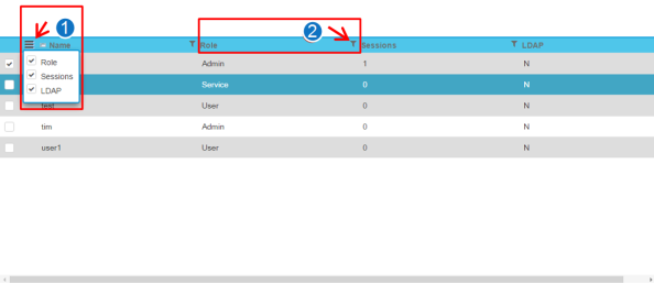
The north panel displays the choices available for each menu selection. Select an item in the north panel by selecting the item’s checkbox. This may change your available options in the operations panel. If you click on another item in the north panel while a checkbox is selected, the item will be highlighted and the information panel and the center panel will change to reflect the highlighted item. The operations panel, however, will reflect the checked item.
| Item | Name | Description |
|---|---|---|
|
1 |
Column selection Navicon | Clicking this navicon opens a dialog box where you can select the columns you want to display in the north panel. |
| 2 | Filter Symbol | Clicking the filter symbol allows you to filter the rows in the north panel based on the column. Please note the filter for each column is to the right of the column name. In the example shown, clicking the filter symbol would allow you to filter the north panel rows by Role. |
| Name | Description |
|---|---|
| Operations Panel Buttons |
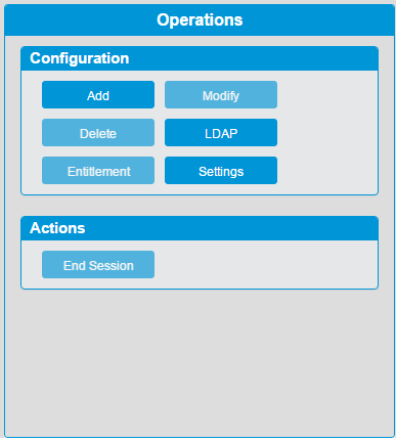
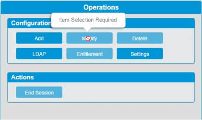
This is where you make changes to the library and perform procedures. The changes and procedures are dependent on what is selected in the north panel. Note that some buttons have an ellipse - the three dots to the right - and some don’t. Buttons without an ellipse will cause an immediate action when pressed. For instance, if you press the Offline button, you will take the partition selected in the north panel offline immediately. If you press a button with an ellipse, another dialog window will open that will allow you to make selections before you take an action. If you hover your cursor over an inactive button, a popup will appear that will tell you why the button is inactive. |
| Name | Description |
|---|---|
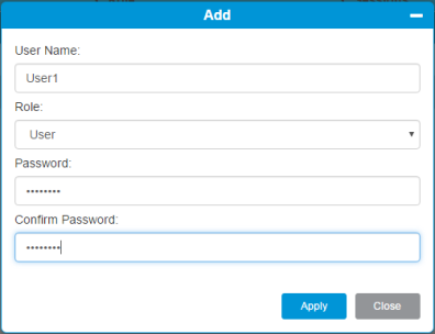
| Dialog Windows | Dialog windows require your input. The Apply button becomes active after you enter the required information. Click the Apply button to execute your input. |
| Name | Description |
|---|---|
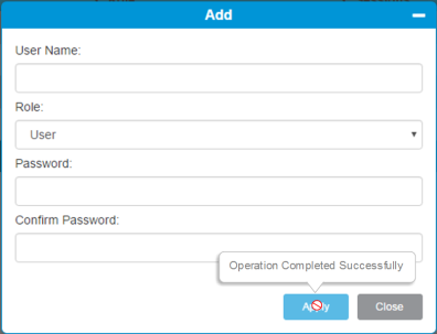
| Action Completion Confirmation | After you click the Apply button, it becomes inactive. Roll your cursor over the button to see a popup that confirms the operation was completed successfully. |
| Name | Description |
|---|---|
| Rollover Message | Roll your cursor over an inactive button to learn why that button is inactive. |
